#12 - How we rebuilt moicdigital.com in 21 days (and the conference that moved our deadline)

João CabralIntelligence Engineer
11 min read
On the afternoon of Friday, September 11, Rogério Berfran, our CEO, came to me with a question:
“I think our website is outdated and no longer reflects everything we need to communicate about MOIC, including our services and current positioning. We’ve evolved as a company, but our website hasn’t kept up.”
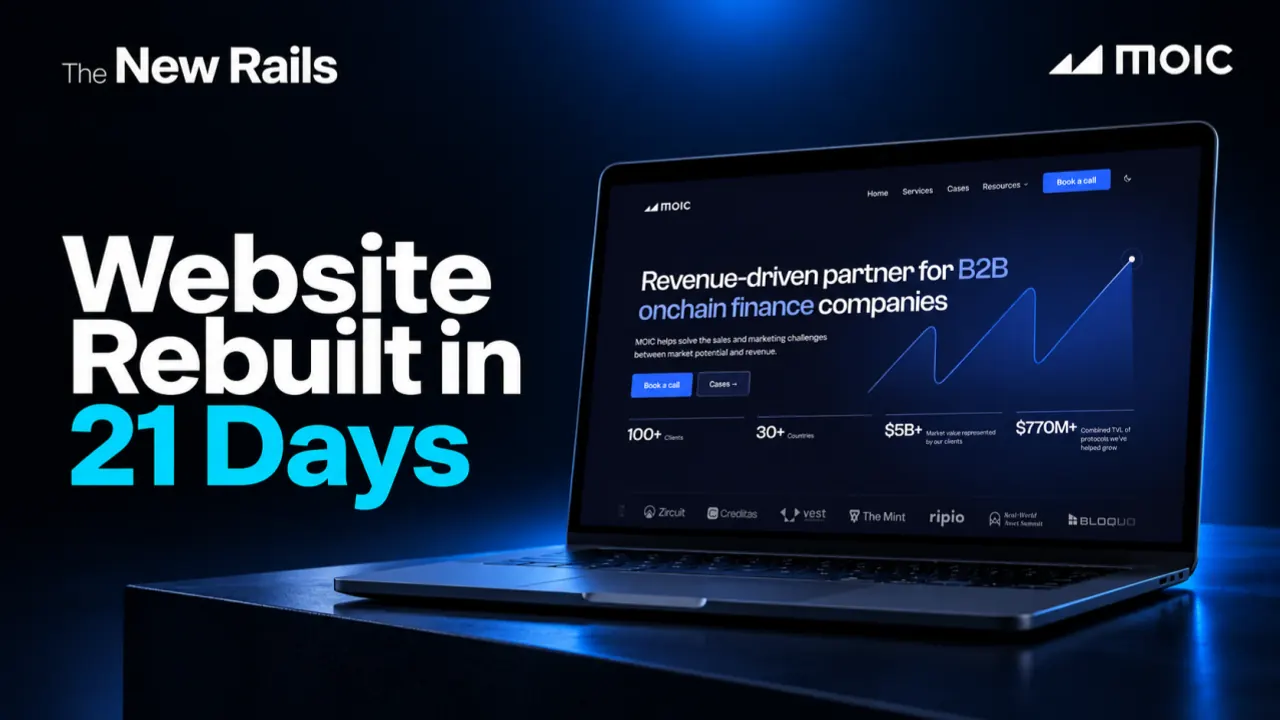
At the time, moicdigital.com ran on Framer. It looked fine and had SEO history and organic visibility worth protecting, but it no longer met our needs.
Updating the website took too much time from the team, making it harder to keep content current and adapt pages as our business evolved. The infrastructure also limited our flexibility, scalability, and ability to create new pages and experiences without unnecessary complexity, while making it harder to evolve our SEO strategy and strengthen our organic search visibility. As always changing all of this was harder than it should have been, but I said yes!
The original timeline called for a few more weeks, but with TOKEN2049 Singapore approaching, we accelerated the project. Twenty-one days later, on the evening of October 2, the new site went live, just five days before the event. We were cutting it close.
This is how those three weeks went, including the parts that went wrong…
Five people and a coding agent
There were five of us. I was the main operator, the person turning every decision into a working page. Tuti Nicola, our Social & Growth Manager, planned the pages, wrote and reviewed the copy, and approved what went live. Arthur de Lara Machado, from our intelligence team, reviewed both the code and the experience, clicking through each version and pointing out what would confuse a visitor or break later. Ricardo Dourado, Rica to all of us, our Design Lead, and João Vitor Moron, our Graphic & Motion Designer, supplied everything visual: brand files, page briefings, reference layouts, covers, and a sharp eye on every round.
Before a single line of code, I sat down with Rica and Moron to agree on the approach. The meeting notes give the reason in plain words: aligning first would save AI credits. Every direction we explored cost credits, and exploring one nobody wanted would have been pure waste.
A homepage that was too long
One of the first meetings of the project was about the homepage, and its first conclusion was that the wireframe was too long. Most of the discussion was about what a decision-maker should see in the first few scrolls. In #5, Tuti wrote that buyers in complex markets rarely reach a first sales conversation without researching the company, and a lot of that research ends on its website. So numbers about MOIC itself, like clients and countries, would sit in a simple strip under the headline, and client results would live inside each case, next to the work that produced them. The brief that came out of that meeting was blunt about how those numbers should behave:
No animated counter. These are credibility numbers, not dashboard numbers.
The deadline was set in the same meeting: a first version of the homepage by Thursday, September 17, presented the next day. After that, a review call every Tuesday afternoon, one page at a time. That plan lasted about two weeks.
Week one: deciding what the site would never do
Before the homepage, I wrote an architecture document, and Arthur reviewed it. Its goal took Rogério’s question literally. Tuti should be able to publish and change content alone, from a browser, while anything that could break the site still went through review. The principle written under it settled most of the arguments that came later:
Autonomy where mistakes are cheap, review where mistakes are expensive.
Most of the document was about saying no. The site would have no content management system, no database and no logged-in area, just plain HTML generated from text files kept next to the code. It would have no third-party scripts either. Under European privacy law, almost every outside script brings a cookie banner with it, and that banner is the first thing a new visitor sees. We wanted that first second spent on our headline. So the fonts are hosted by us, the “Book a call” button leads to Calendly’s own page instead of an embedded calendar, and moicdigital.com went live on October 2 with no cookie banner. Eleven days later we added visit statistics, and the banner came with them: “Reject” is as easy as “Accept”, and nothing loads before the answer.
Then I wrote the brief for the homepage, the way you’d brief a senior contractor who has never met the company: who MOIC is, who the audience is, every section with its real copy, the technical limits, the open questions and a definition of done. Two instructions mattered more than the rest. One told the agent to ask before inventing anything, because “invented content on an institutional page is worse than an honest placeholder.” The other said that no visible text could live inside the code, and that every word had to come from a content file. It reads like housekeeping, and it’s the reason Tuti can change any headline on the site today without calling me.
The brief also listed what the design had to avoid: purple gradients, emoji, a colored stripe down the side of a card, generic drop shadows, icons that decorate without meaning anything. Anyone who has seen enough generated landing pages knows that list by heart.
The first homepage went out as a PDF on Thursday, September 17, on schedule.
Week two: one round at a time
From there the work ran in rounds. Rica and Moron marked up an export or walked through it on a call, Tuti reviewed the copy and flagged anything that didn’t sound like MOIC, Arthur poked at the code and the flow, and I turned every comment into a precise instruction, had the change built and checked it at desktop and phone sizes before sending the next version. On September 24 the homepage went through a copy review and three design passes in a single day. On September 28 the designers sent their notes on the whole page, and by the next day we had briefings for everything else: Services, Cases, Blog, Reports and Careers.
That pace changed how we argued. When a change costs minutes, building it and looking at it is faster than debating it. Later in the project we turned the FAQ background into a moving pattern of icons, straight from one of the design references. Seen again the next morning, it pulled attention away from the questions, so now the icons only appear when a cursor or a finger passes over them. Both versions were real pages, and the decision was made by looking at them.
The conference that moved the deadline
Then, in the final days of September, the approaching TOKEN2049 deadline pushed us to accelerate the project.
The MOIC team would be in Singapore on October 7 and 8, at one of the biggest conferences in our market, meeting exactly the kind of people the new site was being built for. Sending them to the old site after everything we had built made no sense. The Tuesday rhythm was over. The new site had to be live before the team left.
You can read the deadline in the project history. We made 10 changes to the site on September 29, 21 on September 30, 34 on October 1 and 59 on October 2.
September 29 started with hosting breaking. We had planned to use Vercel and moved to Cloudflare instead, and the first build failed with an error that pointed nowhere near the cause. Without a configuration file, the deploy tool had decided on its own to turn our static site into a server-rendered one, and the conversion crashed halfway through processing the images. Reading the build log line by line found it, and a short configuration file fixed it about twenty minutes later. The README now carries a note telling everyone never to delete that file.
The cases took the most care. The site shows 17 of them, and many existed only as short summaries. We filled them in from public sources (our old site, internal notes, posts on X, DefiLlama, the clients’ own blogs) under strict rules: nothing calculated, nothing that contradicted a source, and quotes word for word or not at all. When two sources disagreed, the conflict went onto a pending list for the team to decide. A tool that writes fluently will fill a gap with something plausible if you let it, and a case study is the worst possible place for that.
The copy got one last pass, looking for the habits that make text sound machine-written. Forty-five passages changed. The summary of our Centrifuge case used to read:
From technical complexity to institutional reach, MOIC built and operated a social media engine that turned Centrifuge’s market narrative into consistent distribution, stronger positioning, and measurable growth.
Now it reads:
MOIC built and operated a social media engine that turned Centrifuge’s technical narrative into consistent distribution for institutional audiences.
It promises less, and it’s the version an institutional reader would believe, the same precision threshold Dayane Petik described in #7.
The blog had its own trap. Its 32 posts had addresses Google already knew, so every post kept its URL and every address that changed got a permanent redirect. An audit of all 76 pages still found one we had missed: /sitemap.xml, the file search engines use to find a site’s pages, would have returned an error after the switch. One line fixed it. That kind of problem only shows up when someone checks every single page, which is exactly the tedious work worth handing to a machine.
TOKEN2049 got its own pieces too: an event page with a “Book a meeting” button at the top, and a popup announcing that the team was in Singapore, set to take itself down on October 8 so nobody would have to remember to do it from the other side of the world.
On October 1, Tuti’s notes on the homepage and Services went in during the afternoon, and past seven that night we were still going through the site on phones: more breathing room under the header, services trimmed to their headlines, map locations picked with buttons because the dots were too small to tap.
October 2
Launch day had 59 changes, close to half of everything the project had by that night. Most were small: bigger touch areas for small links, dashes removed from page titles, the privacy page published, Sales & Pipeline moved to the top of the services list.
The contact form changed destination twice. It started the day sending leads to a generic webhook, switched to a Google Sheet at 1:27 p.m. and, at 2:45 p.m., went straight into Kommo, our CRM. Because the form only talks to the site’s own address, none of that changed what a visitor sees. Each lead now lands in the sales pipeline with its source, tags and a note with everything the person wrote, and the visitor goes on to Calendly to book the call.
At 3 p.m. the plan was to launch without the blog. Careers and Reports had already been held back for another round, and the blog looked like the next thing to go. By 4:42 p.m. it was back in. The live site only carries the pages listed in one short file, and taking a page off that list also removes every link pointing to it, so cutting scope that late in the day was safe, and so was changing our minds.
At 6:31 p.m. the final version of the runbook for the domain switch was in, and its first item was email. The same DNS records that send a visitor to a homepage also tell the internet where to deliver a company’s mail, and a careless move would have left everyone at MOIC without an inbox until someone noticed. Every record had to be copied to Cloudflare and checked against the old provider before anything else moved.
At 7:12 p.m. the launch was approved. The domain moved, we went through the live pages one by one, and Framer was closed for good, with a rollback ready if anything went wrong.
At 8:37 p.m. the project notes were updated: the new site was live at www.moicdigital.com.
Five days later, the team was at TOKEN2049.
What we’d keep
The agent wrote most of the code, audited every page and drafted most of the documentation. It couldn’t decide which numbers were true, which pages to launch without, whether a background was competing with the content or which service should lead. Those calls belonged to Tuti, Arthur, Rica, Moron and me, and they took far more of my three weeks than the code did.
Two habits kept the pace safe. Changes stayed small, so each one could be checked in a browser in a minute or two. And the rules lived in files instead of in people’s heads: instructions the agent reads at the start of every session, a check that blocks publication when something is broken, a runbook for the domain switch.
Rogério’s question is answered by how the site works now. When Tuti wants a new post or a different headline, the request goes in, in Portuguese, from a browser, and the text shows up in English on a staging site hidden from search engines. It goes live once someone approves it and the automatic check passes. A week after launch, TOKEN2049 moved to the “Where we have been” section, and the popup started pointing to Money20/20 USA in Las Vegas.
In #2, Rogério asked what becomes expensive once AI makes execution cheap. Rebuilding our own website gave us a small answer: judgment about what’s true, what to cut and what a buyer should see first.
If you’re building in Onchain Finance and want to see how we bring the same mix of speed and judgment to marketing and sales, let’s talk.